print & layout design
effective communication will decide the reader’s engagement with the content, layout is one of the most important ways to present information to the reader. A well-designed print and layout can grab the reader’s attention, make the content more accessible, enhance the visual appeal, and convey the intended message more effectively, ultimately leading to better engagement and understanding of the content.

Save the Date
Design

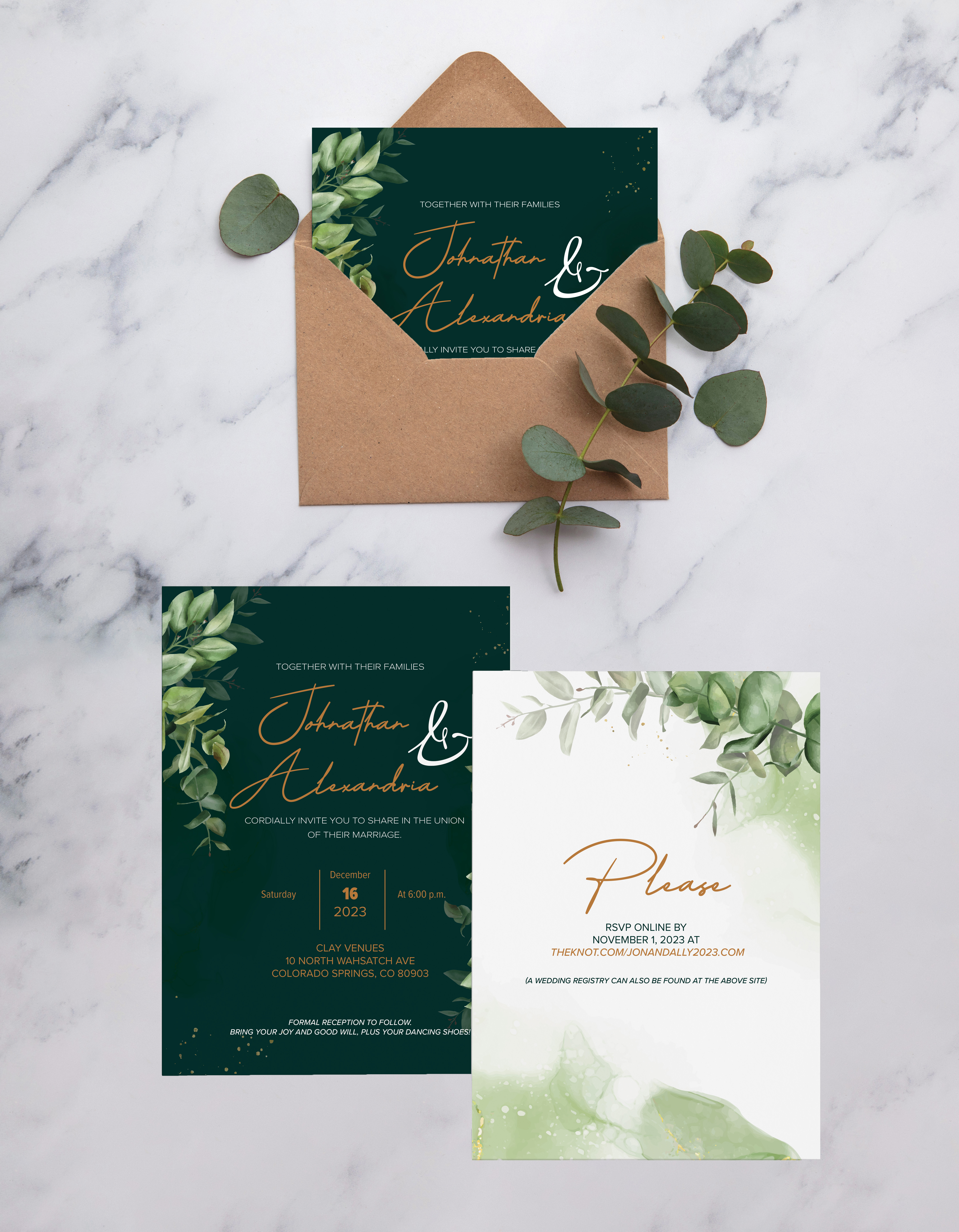
Wedding Invitation
Design
Meticulously crafted with unwavering attention to detail, this invitation showcases bespoke typography, seamlessly intertwining the couple’s names—a visual representation of their journey converging into a harmonious union. The inclusion of delicate illustrations, thoughtfully inspired by the couple’s shared passions, imparts a uniquely personal touch to the invitation. The result is a sophisticated and enchanting masterpiece that promises to set the tone for an unforgettable and elegant celebration of their union.
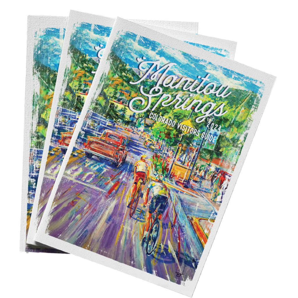
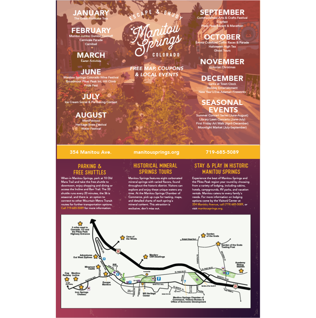
Manitou Springs Visitor Guide 2024
I designed the 2024 Manitou Springs visitor guide, carefully crafting its layout and content to provide an engaging and informative experience for readers while adhering to the established brand standards. With over 65,000 copies distributed across the country and state, the guide serves as a comprehensive resource for both visitors and locals, offering insights into local businesses, events, and other fun activities.
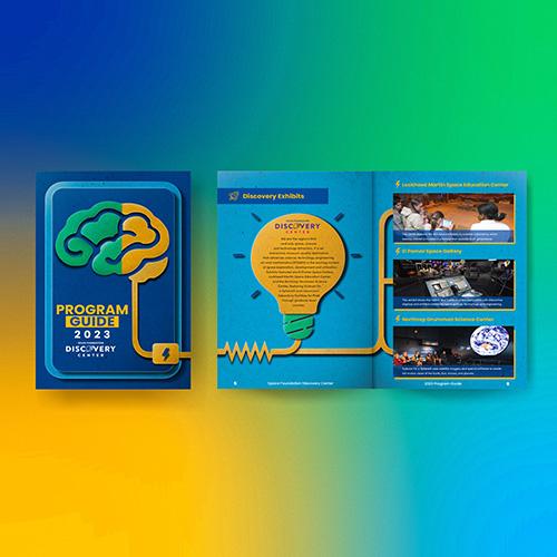
Space Foundation Discovery Center Program Guide Booklet
The Space Foundation Discovery Center has produced an informative booklet that showcases the STEAM programs and exhibits available at the Center. The booklet features exquisite illustrations that emphasize the importance of STEAM education, and employs symmetrical alignment to draw the attention of parents and other interested parties.
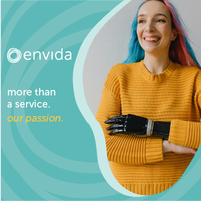
envida Brochure
Creating the Envida brochure was a journey rooted in simplicity and community focus. We embraced a minimalist design, choosing clean visuals and a color palette reflecting the local landscape. Content highlighted Envida’s commitment to diverse clientele and community service. Iterative design ensured simplicity and readability, with strategically placed calls to action.

Out of Africa Safari co
Brand Guidelines
Out of Africa Safari Co is a premium safari company headquartered in Africa, dedicated to providing its guests with a magical and unforgettable experience. As part of its branding strategy, the company has developed comprehensive guidelines detailing how its logo and brand will be marketed and presented to the public.
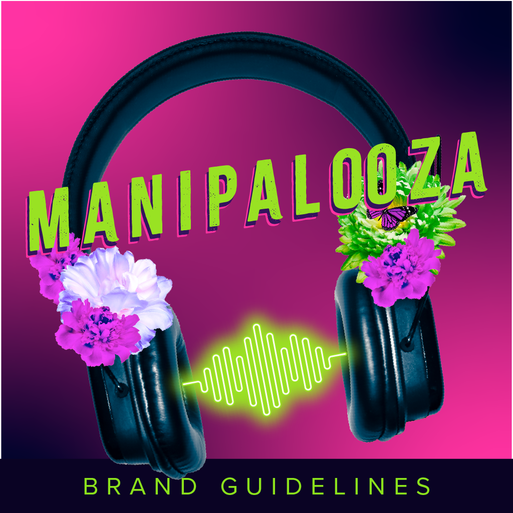
Manipalooza Brand Guidelines
I developed comprehensive brand guidelines for Manipalooza, our local annual event, to establish a cohesive and engaging identity. The process involved extensive audience research, allowing us to create a brand that resonates with our target audience. These guidelines encompass all aspects of the event’s visual and verbal identity, including logo usage, color palettes, typography, and tone of voice. By focusing on the preferences and expectations of our audience, the brand guidelines ensure a consistent and appealing presentation across all marketing materials.
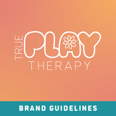
True Play Therapy
Brand Guidelines
Crafting the brand guidelines booklet for True Play Therapy was a thoughtful journey that aimed to encapsulate the essence of their therapeutic approach. The design harmoniously blended calming hues and playful elements to resonate with the spirit of play therapy. Typography choices reflected both professionalism and warmth, mirroring the delicate balance True Play Therapy achieves in their practices. Each page meticulously detailed logo usage, color palettes, and tone of communication, ensuring a cohesive and empathetic brand identity.

Liam's Lighthouse Foundation Brochure Redesign
Liam’s Lighthouse envisioned a revitalized brand identity, prompting a redesign for a modern and polished appearance. Recognizing the need for clarity and professionalism, the previous design was reimagined to address readability concerns. Employing a sophisticated color palette and typography inspired by the logo, the result is a sleek and distinctive design that effortlessly communicates all essential information. This strategic approach not only enhances the visual appeal but also aligns seamlessly with the professional standards that Liam’s Lighthouse sought to achieve in their brand image.
Manitou Springs Business District Map 2024
This map was designed to be an invaluable resource for both locals and visitors. With over 60,000 copies printed and distributed statewide, the map highlights key businesses, attractions, and amenities in the area. It provides a clear and accessible layout, making it easy for users to navigate and explore the vibrant offerings of the district. The layourt design ensures that all information is easy to find and understandable, thereby enhancing the experience of exploring Manitou Springs.
Botani Blendz Menu Cube

The menu cube I crafted for Botani Blendz is a tactile and visually engaging masterpiece designed to elevate the customer experience. Each face of the cube unveils a unique facet of Botani Blendz’s diverse offerings, blending vibrant colors and enticing imagery that tantalize the senses. The cube serves as a dynamic and interactive menu, allowing patrons to explore a spectrum of delicious and nutritious options. Its three-dimensional design not only adds a touch of innovation to the ordering process but also reinforces Botani Blendz’s commitment to creativity and a wholesome culinary journey. This menu cube stands as a testament to the fusion of art and functionality, enhancing the overall dining experience at Botani Blendz.
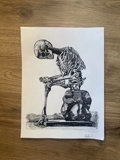
Gray's Anatomy Cover Redesign

The cover of this book not only serves as an introduction to the contents within but also as a contemporary reinterpretation of traditional anatomy book aesthetics. At its core is an original illustration that transcends the ordinary, capturing the essence of the subject matter with a fresh perspective. The illustration process involved a fusion of artistic creativity and scientific precision, resulting in a visual narrative that seamlessly communicates complex concepts. Meticulous attention to detail extends beyond the illustration to the strategic placement within the layout, ensuring a visually engaging and informative reading experience. This fusion of artistry and precision harmonizes to create a cover that not only entices the reader but also promises a modern and insightful exploration of the subject matter within the pages.