logos, branding, collateral
make your mark: exceptional logo design and branding services for your business
Liam's lighthouse logo redesign & collateral
Liam’s Lighthouse, a nonprofit foundation, sought a logo redesign to enhance their visual identity in accordance with established brand standards. Recognizing the limitations of their outdated logo, I set out to create a new design that would evoke a sense of stability and credibility befitting the organization’s mission.
To achieve this objective, I skillfully crafted a graphic that seamlessly integrates with the text, creating a cohesive and harmonious design. The strategic use of lines and color contributes to a sleek, timeless aesthetic that lends a sense of sophistication to the logo.
Overall, my approach to the redesign reflects a deep understanding of the importance of visual branding and the need to convey an organization’s values and personality through design. The resulting logo effectively communicates Liam’s Lighthouse’s mission and vision, while providing a professional and polished image that resonates with its target audience.

logo
In designing the new logo for Liam’s Lighthouse, I focused on conveying credibility and aligning with the organization’s values and mission. I carefully selected colors associated with the HLH (Hemophagocytic Lymphohistiocytosis) community to create a visual connection to the foundation’s commitment to supporting those affected by the condition. The incorporation of a lighthouse, a symbol of hope and guidance, reinforces the foundation’s mission of providing support and assistance. The design effectively communicates the organization’s values and mission, offering a sense of strength and reassurance to its audience.
branding
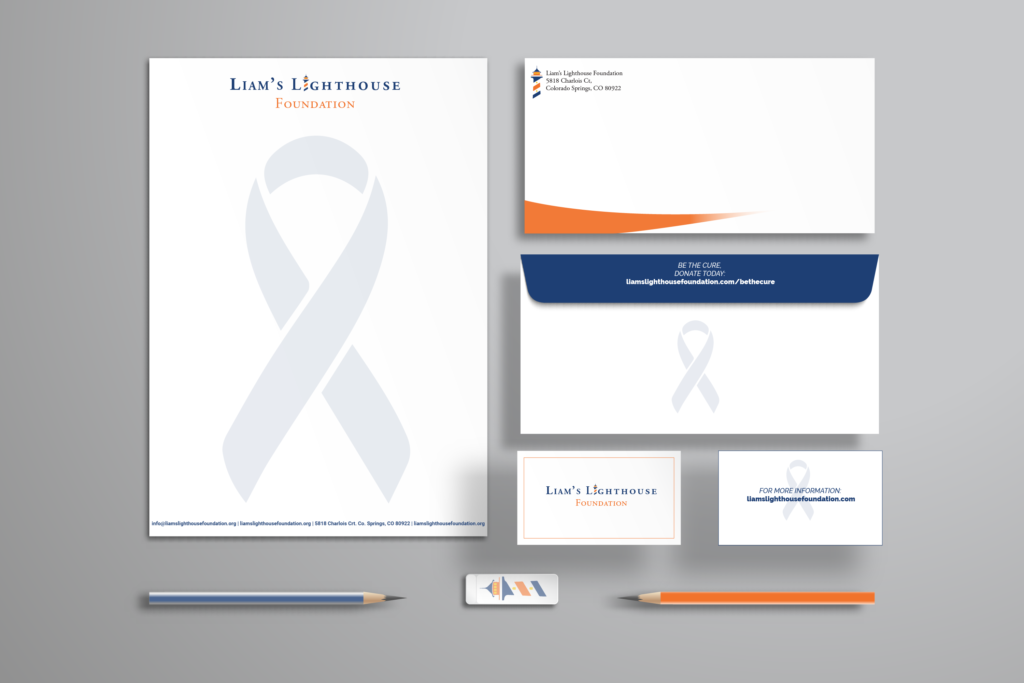
Through meticulous branding strategies, Liam’s Lighthouse can establish a strong brand image, enhance brand recognition, and foster unwavering loyalty among their clientele. By ensuring that all marketing communications align with their brand identity, the foundation can effectively differentiate itself from competitors and position itself as a trustworthy and authoritative leader in its niche. A well-crafted branding strategy, encompassing a unified visual identity, consistent messaging, and strategic engagement across multiple channels, can elevate the brand’s profile and visibility within their target audience. Ultimately, this approach will enhance Liam’s Lighthouse’s reputation and increase their impact within the HLH community.
collateral
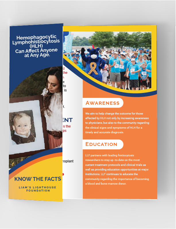
An efficacious brochure ought to convey a lucid and succinct message that accentuates the advantages of the product or service proffered. It should possess a visually engaging layout featuring superior-quality imagery and an attention-grabbing design that captivates the reader’s interest.
Manipalooza
ManiPalooza is a vibrant event dedicated to celebrating individuality and fostering a sense of unity through music and dance. Guided by the mission statement, “We believe in fostering an atmosphere where individuals can feel free to express themselves authentically, without fear of judgment,” the event invites attendees to fully embrace their uniqueness.
ManiPalooza was created using extensive audience research, guiding the selection of vibrant colors, bold graphics, and playful typography. These visual elements were carefully chosen to appeal to a diverse audience who values self-expression and creativity, creating an inviting and engaging atmosphere that fosters a sense of belonging.


logo
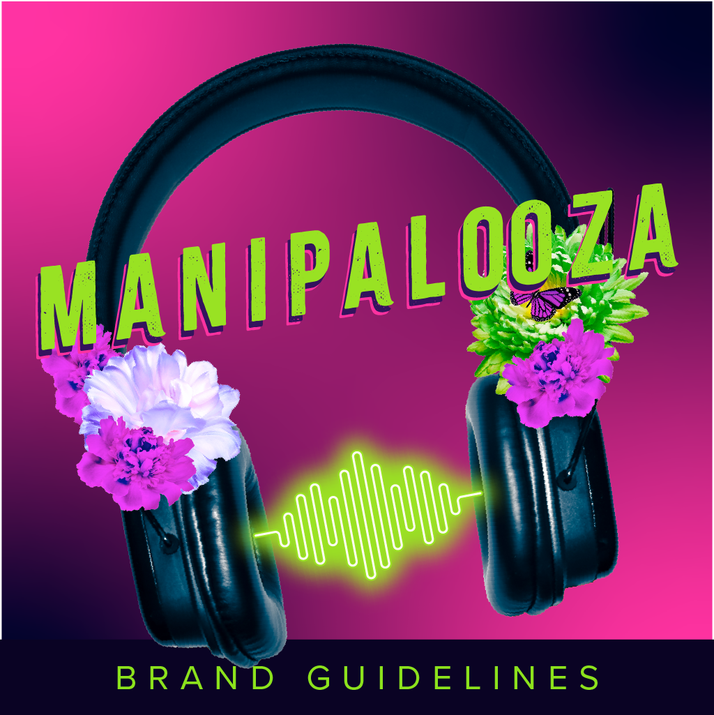
The ManiPalooza logo embodies the event’s philosophy and commitment to community entertainment, capturing the transformative power of dance. Its vibrant design elements convey dynamism and excitement, with an italicized font symbolizing progress and movement. The playful and expressive font family reflects the event’s lively atmosphere, inviting participants to embrace their creativity and individuality.
brand guidelines
The ManiPalooza brand guidelines outline the visual and conceptual elements that define the event’s identity. They specify the use of vibrant colors, playful and expressive typography, and dynamic design elements that convey energy and excitement. These guidelines ensure consistency across all promotional materials, reinforcing the event’s focus on creativity, individuality, and community. The guidelines also emphasize the importance of maintaining an inclusive and welcoming tone, aligning with ManiPalooza’s mission to celebrate self-expression and unity.

marketing
Manipalooza’s tailored marketing plan effectively attracted a specific target audience through a mix of digital and print media. We utilized social media, email newsletters, and online ads to connect with a broad audience, while vibrant posters, flyers, and brochures were strategically distributed in the community. All marketing materials were designed to reflect our mission and values, ensuring cohesive branding and effective communication. This comprehensive approach successfully generated excitement and anticipation, attracting art enthusiasts and music lovers to the festival.
true play therapy logo redesign
With a strategic approach, we embarked on a journey to enhance professionalism and optimize visual appeal. The updated logo seamlessly blends modern aesthetics with the core values of True Play Therapy, creating a refined and sophisticated emblem that resonates with their audience. Meticulous attention was given to every element, ensuring that the logo not only reflects the professionalism of the organization but also adapts seamlessly to various platforms.
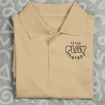
logo
The logo for True Play Therapy embodies the essence of therapeutic care with a design that speaks volumes. Crafted with precision and thoughtful consideration, the logo seamlessly integrates elements that symbolize the transformative power of play in the therapeutic process. The imagery is not merely a visual representation but a narrative in itself, capturing the spirit of healing and growth.
brand guidelines
Crafting the brand guidelines booklet for True Play Therapy was a thoughtful journey that aimed to encapsulate the essence of their therapeutic approach. The design harmoniously blended calming hues and playful elements to resonate with the spirit of play therapy. Typography choices reflected both professionalism and warmth, mirroring the delicate balance True Play Therapy achieves in their practices. Each page meticulously detailed logo usage, color palettes, and tone of communication, ensuring a cohesive and empathetic brand identity.

digital marketing
The brand guidelines from True Play Therapy served as the compass guiding the digital marketing strategy with precision and coherence. Every aspect, from color schemes to typography, was meticulously implemented across various digital platforms, ensuring a consistent and recognizable brand presence. The guidelines not only established a visual identity but also informed the tone of communication, fostering a sense of trust and familiarity among the audience. Through social media campaigns, email marketing, and website design, the brand guidelines played a pivotal role in creating a cohesive and resonant narrative.
Adventures in caving logo and branding
Adventures in Caving represents a local guiding service for spelunking enthusiasts, prioritizing both amusement and safety. The logo design prominently features a traditional carabiner, symbolizing the company’s robustness and dependability, while the typography conveys a sense of determination and exhilaration.

logo
The Adventures in Caving logo boasts a diverse design, capable of being presented in full color or black and white. Its primary purpose is to evoke a sense of security and excitement through the clever utilization of a carabiner graphic and gritty typography.
branding
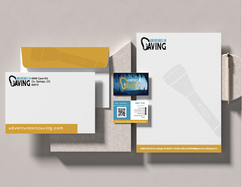
When it comes to branding, Adventures in Caving employs a strategic use of playful yet calming color schemes to establish a robust brand identity and a name that exudes trustworthiness.
direct marketing
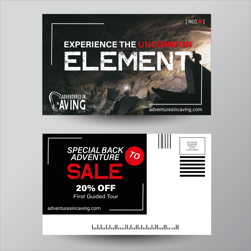
The promotional collateral utilized by Adventures in Caving is deliberately crafted to capture the attention of a younger demographic seeking adventure and exhilaration. The materials are designed with bold and vibrant hues to effectively communicate the desired message of fun and excitement.
88 Street clothing logo and branding
88 Street Clothing is a Colorado Springs-based fashion brand that caters to young adults of all genders and non-binary identities. Their focus lies in promoting individuality and self-expression through their unique and outgoing clothing designs. Additionally, the brand is committed to advocating for sustainable fashion practices by utilizing recycled materials.
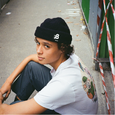
logo
The design of the Eighty Eight logo was strategically crafted with the younger generation in mind. The sustainable clothing brand seeks to provide a simple yet alluring aesthetic, which is reflected in the logo’s design. The use of negative space in the logo not only conveys a sense of playfulness but also represents innovation and creativity.
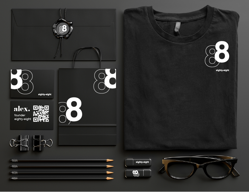
branding
Eighty Eight has established a strong brand identity by embodying a straightforward and simplistic approach in all their marketing endeavors. The brand consistently utilizes its signature colors and typography across all its branding materials, resulting in a cohesive and recognizable visual identity.

digital marketing
The promotional collateral created by Eighty Eight targets a youthful audience and focuses on promoting environmental sustainability. The brand utilizes a minimalistic design style and employs a low-key brand voice to effectively communicate its message to its target audience.
