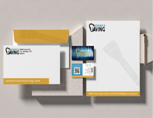
The brand color scheme incorporates earthy tones such as light blues, reflecting the natural and adventurous aspects of caving. These colors are used consistently across all marketing materials, including the website, social media, and printed materials.
The brand messaging focuses on the sense of adventure, exploration, and discovery that comes with caving, while emphasizing safety and responsible exploration.
The logo I design provides a sense of stability and credibility for the foundation. The graphic is apart of the text and the lines and color provide a sleek classic look to the design.